01 Jun New Site Summer 2017
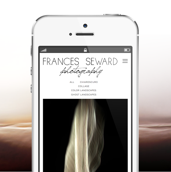
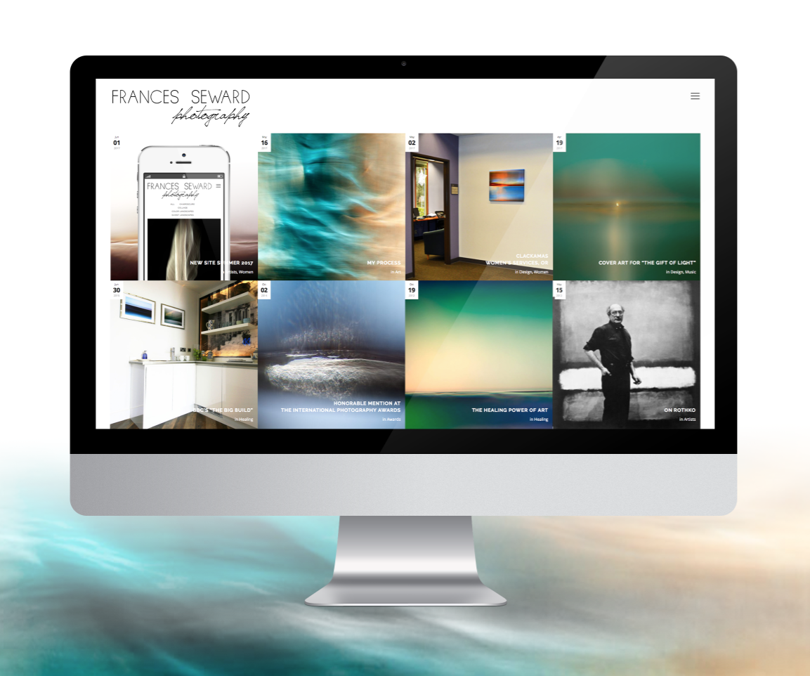
I’m pleased to announce the release of my new web site…live June, 2017.
As my portfolio has evolved over time, so has my creative vision for my work.
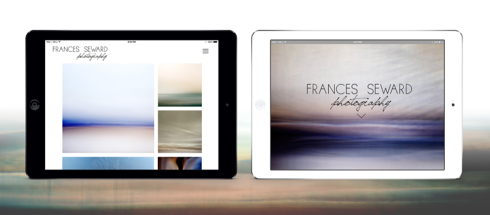
In 2016, I decided I was ready to take my work to the next level, and realized that improving my online presence through a new web site and social media strategy was going to be key. While I was thinking about what would be most important to me in a new site, I realized I really wanted a mobile friendly website that was clean, minimal, and reflected my style. I also wanted it to be non-traditional without being difficult to use.
A Collaboration
While I was thinking about what direction I wanted for my new site, I reviewed hundreds of websites for creatives. With so many options, I decided to consult with a professional to create my new site. I was referred to web developer and identity designer Acacia Carr. Acacia is a Santa Fe/California based creative that specializes in helping other creatives develop their careers through targeted branding development including print, web, and experiential design. She also specializes in responsive (mobile friendly) web development, so her expertise has been very valuable during our project.
Through our collaboration, Acacia has helped me focus on the important aspects of my work, and how to best present my art so that my audience can have a dialogue with my vision.
 During our creative strategy sessions for this project, we identified the types of people I want to connect with through my site. Acacia calls this the Dream Client. In order to attract your Dream Clients, Acacia believes that you have to clearly visualize exactly who that client is. The idea is that only once you know who your audience is can you truly begin to connect with them through your brand. So together, we identified who my Dream Clients are, and how I want to connect with them. This site is a collaborative project between myself and Acacia in reflection of that vision.
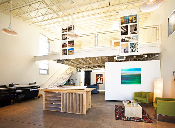
 If my web site were a house, I would want it to be filled with light, like the space where I have my prints made (shown here).
Since the strength of my work is in its subtlety, Acacia and I chose to use a minimal white theme design to allow my work room to breathe. Overall, I think the site is a balance between playful but barely there details. We went for simple elegance including the use of sans-serif fonts and muted colors throughout the site.
We brainstormed several different concepts for the presentation of the Works area itself, and decided to go for a fun, mixed dimensions portfolio grid for the Works area.
For our software platform, we chose WordPress because it’s easy to manage and scalable. Acacia provides training during her site projects, so I can manage my site myself easily.
On branding and Artists
One of the things Acacia and I discussed was whether or not branding was important for artists and even if it was acceptable for “real” artists. As we talked about different artists, it became immediately clear that they all had their own brand in own way or another. The most memorable artists of all time are known not just because their art was great…but often because there was something about them personally that people remembered.

Consider van Gogh’s gift of a left ear, Dali’s mustache, or Warhol’s signature blend of commercial art…these are all distinct features of their brand. These artists names are well known because there was a persona behind the art. There are plenty of lesser known and even more completely unknown artists who will not receive the recognition they deserve because they don’t learn to develop their personal brand.
This website is an important piece in the evolution of my brand development. It’s also the result of much dreaming, researching, planning, developing, and testing.
We hope you enjoy the result!
– Frances


Sorry, the comment form is closed at this time.